Overview
Problem
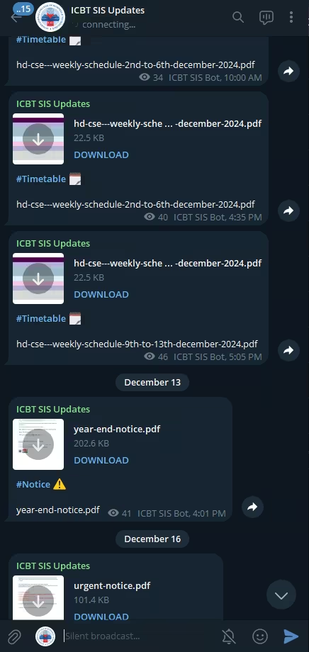
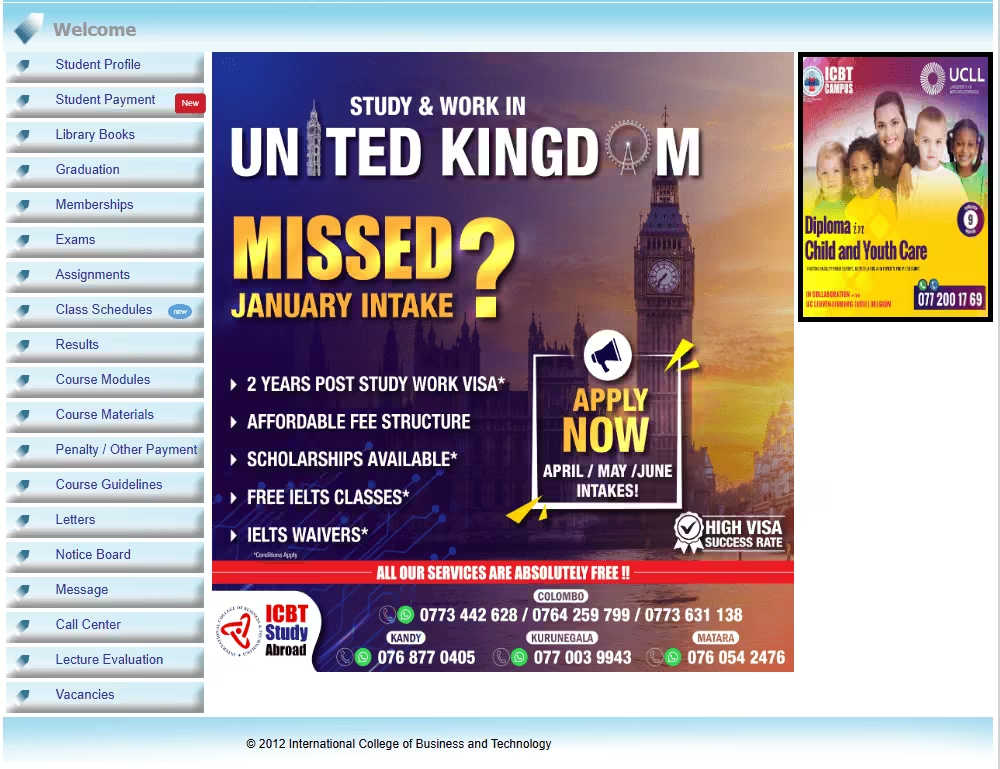
My University portal is outdated, difficult to navigate, and filled with too much info. This led to frustration as students struggled to access essential services like class schedules, assignments, and announcements. Important updates and notifications were often missed due to poor management and visibility. And it impacting the student's academics.
Objectives
- Redesign and develop a website that delivers exactly what students need.
- Focused on important updates in a minimalist design.
- Implement an automation system to notify students about important updates in real time.
User Research
Participants
12 students (undergraduate)
Key Findings
- 83% of students found the portal overwhelming and difficult to use.
- 3 students reported attending canceled lectures because they missed notices posted only on the portal.
- 67% of students admitted to frequently missing assignment deadlines or updates due to a lack of visibility.
- 100% of students requested a mobile friendly version of the portal.
- All the students agreed that the portal needed a notification section on the dashboard for important updates.
- 0% liked the current user interface
Pain Points
- Missing important updates
- Poor organization and visibility of important updates.
- Confusing navigation flow
- Filled with too much info and features.
Design
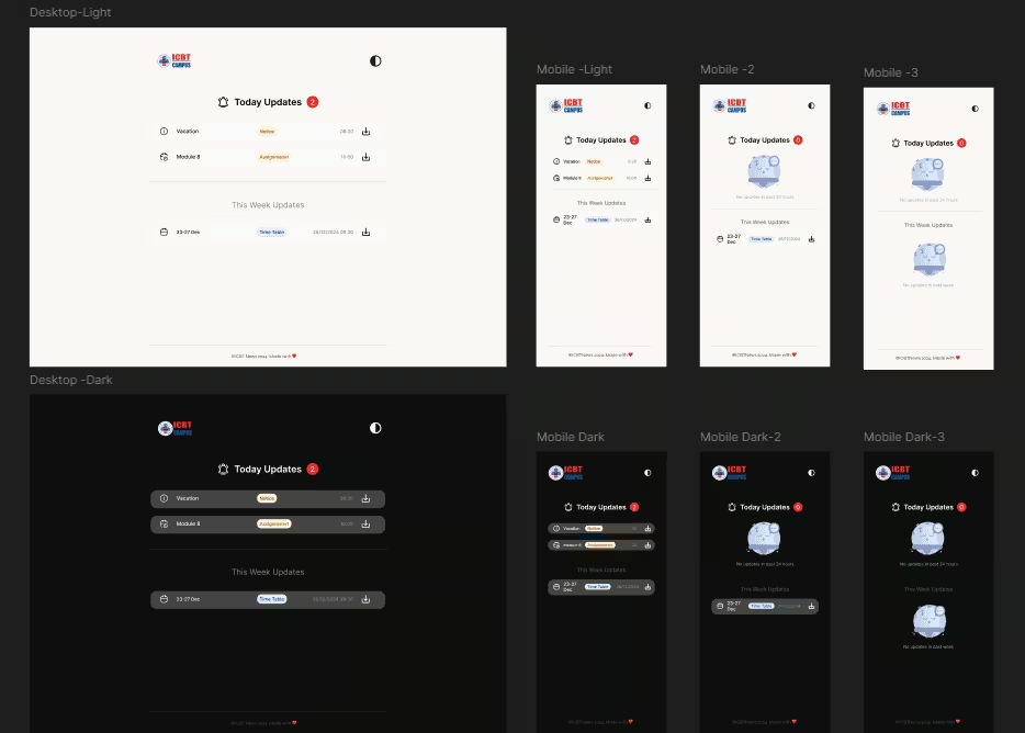
The redesigned interface focuses exclusively on the core pain point identified during user research,
Missing critical updates
What I excluded
Student payments
Exam results and grades
Library membership
Why I excluded
These sections are personalized and require logging.
They are not part of the students' daily interaction flow
No login and no clutter
Redesign Focus
Daily & weekly updates
No login required
Mobile friendly UI
Dark mode
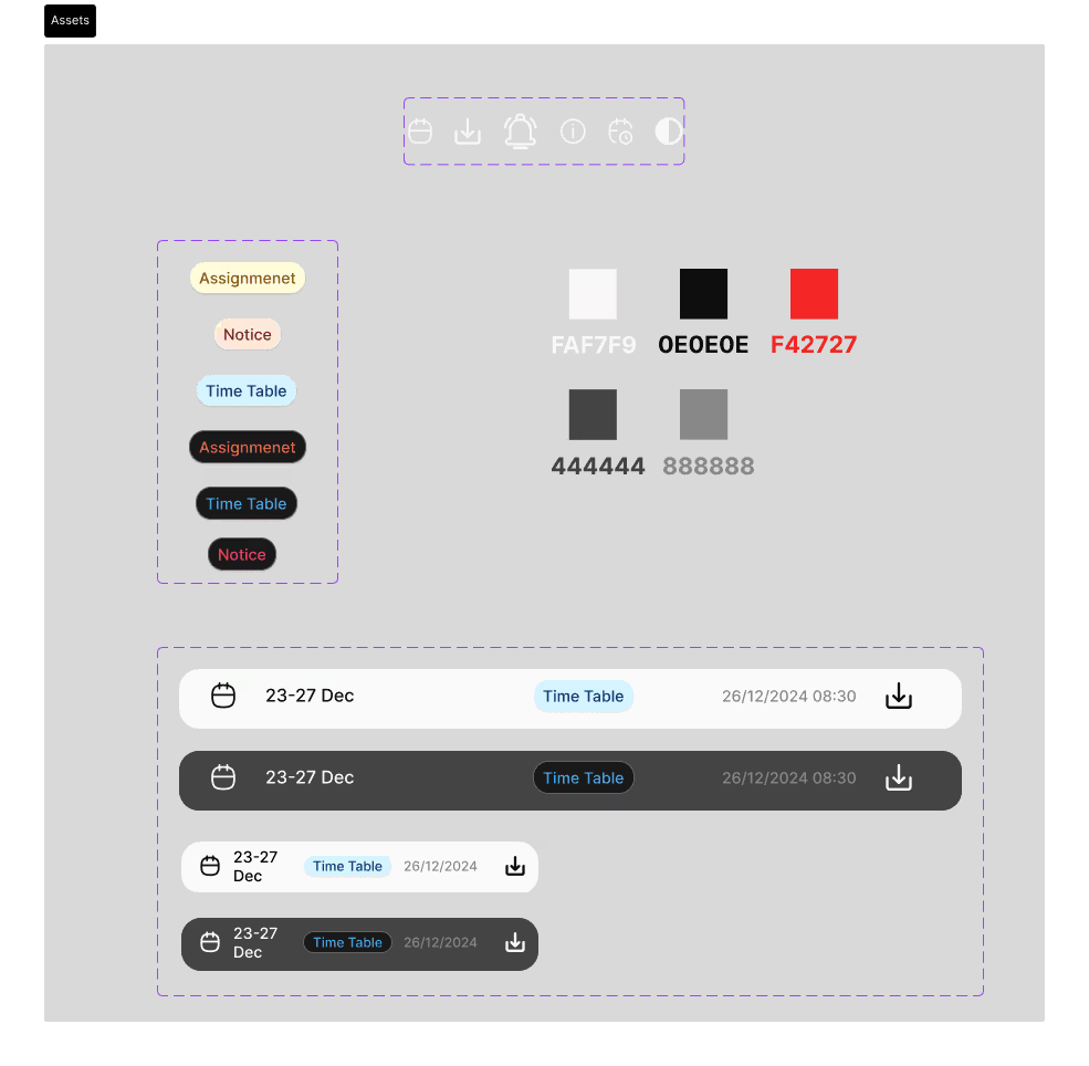
High fidelity prototypes

Final Design
Notifications